NTUC Design Challenge
A better school journey through digitalization

THE PROJECT
We'll have a look at the process used to digitalize the relationship between small-kids' parents with their schools and teachers. What are the parents' expectations? What do we need to address first? Let's find out.
RESEARCH
INTERVIEWS
The few conducted interviews showed that parents of very young kids are mostly sharing the same concerns when leaving their children under someone else's supervision for the first time. The safety and happiness of the child, plus the ability to develop himself, were every time the primary concerns. Some were also troubled with the cost that daycare represents.
Here are some of the few questions I've asked the parents, listed with the most common answers.
QUESTION A
What was the primary consideration when choosing a daycare?
- 33%
background of the staff
- 47%
core beliefs
- 20%
the learning environment
QUESTION B
In the end, what triggered your final decision?
- 60%
other parents reviews
- 30%
talking with staff
- 10%
cost
QUESTION C
Overall, what did you apprehend the most?
- 50%
the first day at school
- 50%
leaving him
PERSONAS
I had the opportunity to talk with a total of 12 parents. Mostly mothers.
Here is an example of a short persona that reflects a typical parent profile of the panel and, most likely, our App's usual audience.
For the matter of this exercise, I will only be showing a unique and straightforward persona.

A BUSY MOTHER
Sheryl Tan, 36, Brand Manager in Luxury
Sheryl is a carrier driven person with a high level of education.
She is curious, reads at least a book per month, and loves to go out for a drink at least once a week. She is comfortable with mobile devices and technology in general
She feels terrible about leaving her daughter to daycare every day but understands how important it is for her development. She is looking very closely at her daughter's progress during daycare and takes every opportunity to gather feedback from the staff.
PROBLEMS
From the answers' list, I've extracted several problems to solve and validated them with the same panel of parents.
- 01
Parents want more knowledge of their kids' progress
- 02
Parents are subject to a lot of stress and guilt
- 03
Parents wish they had heard more often from teachers
Noticeable: 5 parents added they would love to see their kids on a live stream or regular pictures during the week.
GOALS
We already know we are doing a mobile app as it is the best tool to get in touch quickly. To be successful, this App must appear as a side aid that will promptly address parents' stress and be extremely simple and straightforward to use—a tiny room for a learning curve.
- 01
Ease parent's stress
- 02
Ultra-simple to use App
- 03
Ease the communication between parents and school.
DESIGN PROCESS
Problems and goals identified, I will now define and work on the MVP. Critical step, the MVP will allow me (and any involved team) to focus on what matters the most.
Alternatively, by reducing the scope like this, it gives more time for testing, iteration and validation of user flows and design ideas.
MVP
KEY FEATURES
After gathering data from the interviews, we understand that time and emotions are critical components of the journey of being a parent with a kid at school. Onboarding the parents through the necessary steps of using this new App will be crucial to its success.
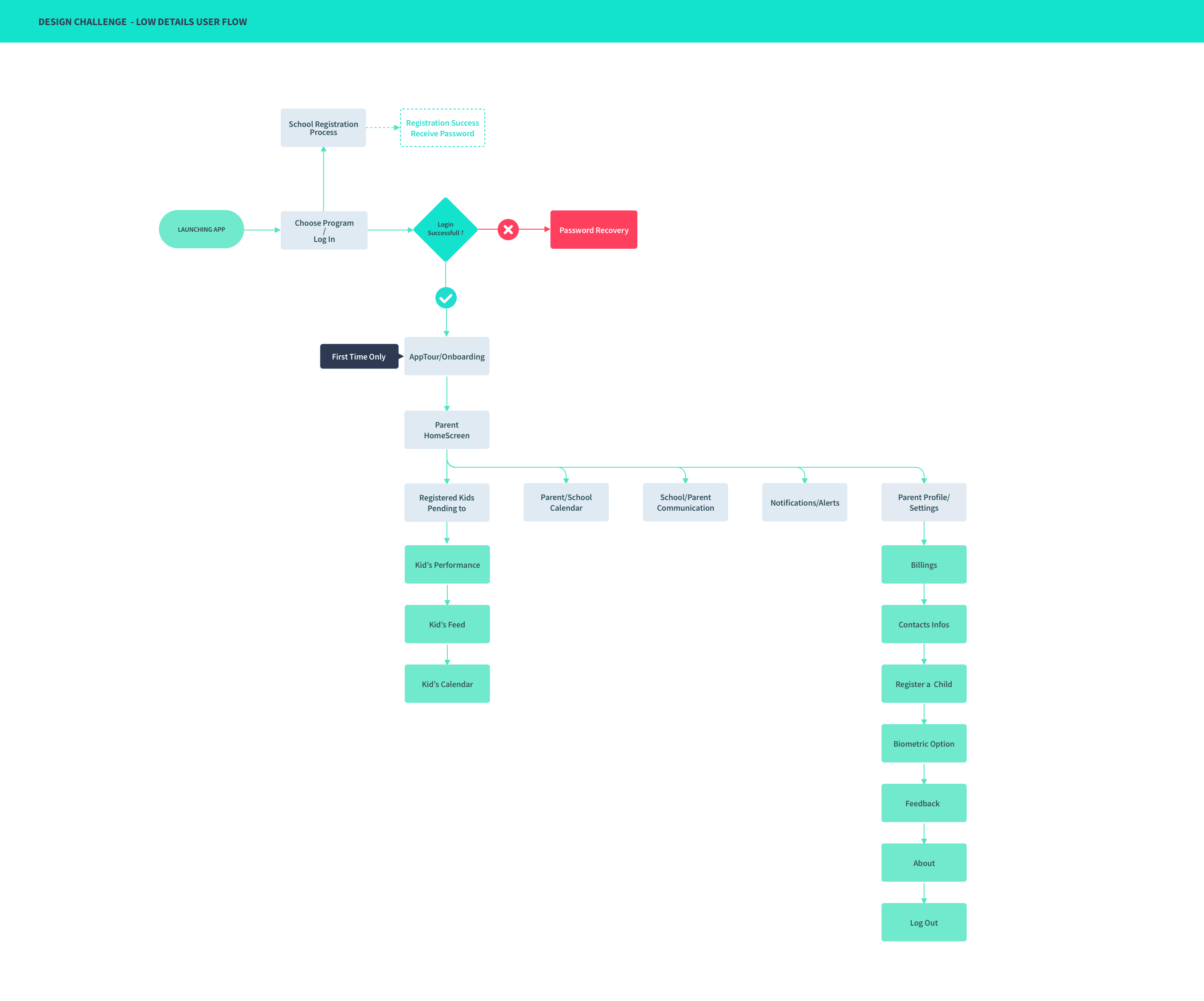
Essential flows in this App are going to be:
- -
Connecting / Registering to a new school
- -
Onboarding parents through the list of features
- -
First feedback from school
During interviews, the registration process did not seem to be the most stressful part. Availability to the school of choice is more stressful than the process itself, but parents know they have no control over that, besides trying to register as soon as possible. Nothing in this App is new for modern parents. It will mostly consist of lists, chats, and calendars. Therefore onboarding should be easy.
That said, I think the essential factor of success for this App is its ability to empower the parents. It provides them with a sense of actively contributing to their child's growth during school. Onboarding and empowerment should be the core focus of the user experience and feature set.
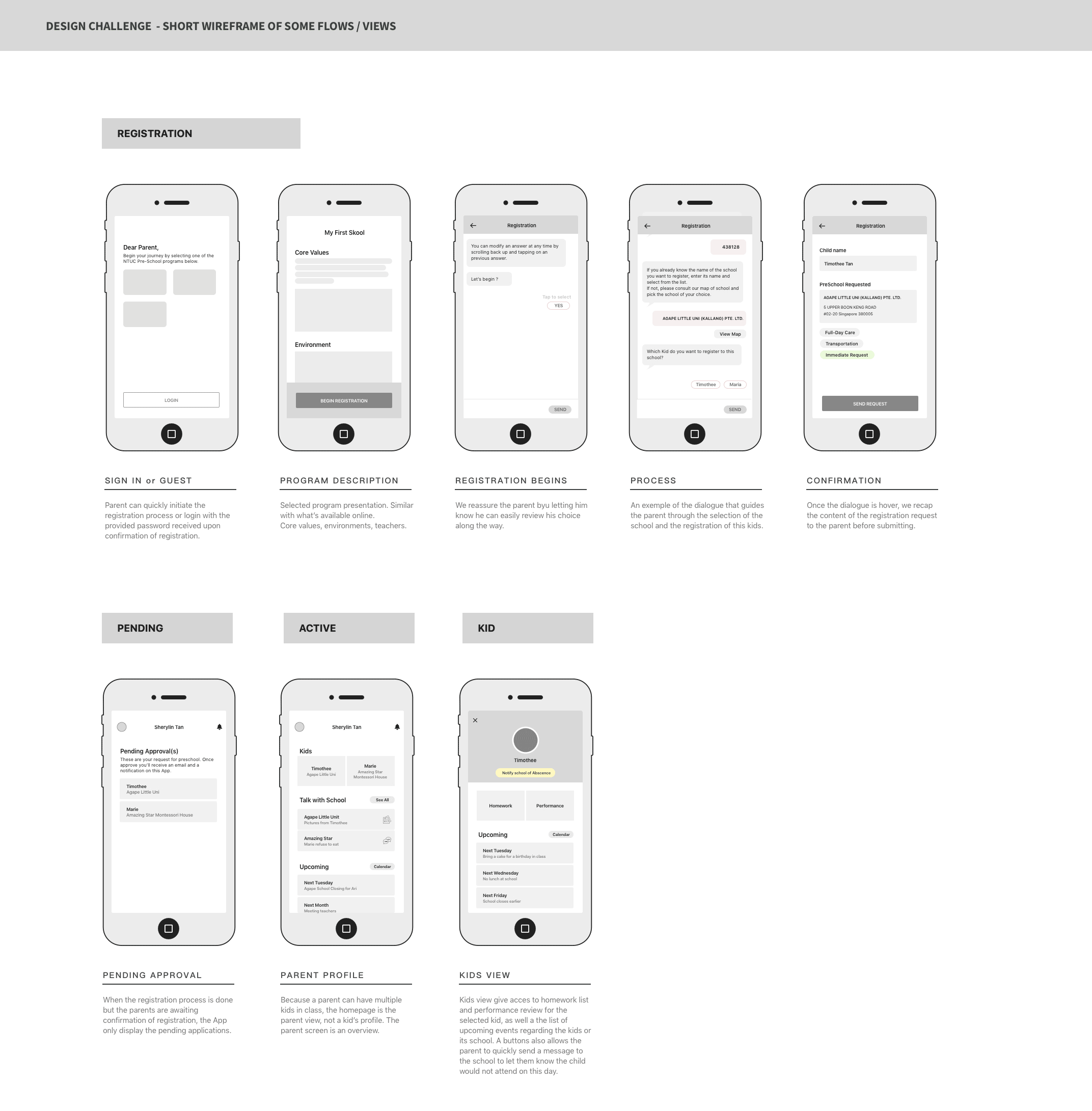
WIREFRAME
Once the flow is validated and reviewed with the different stakeholders, we can start iterating using a wireframe. A low definition wireframe is a quick and easy way to determine the best way to show a feature to the user while validating the user flow. Every member of the team should have a look and a word to say regarding the wireframe. It is the perfect time to throw some good ideas out.
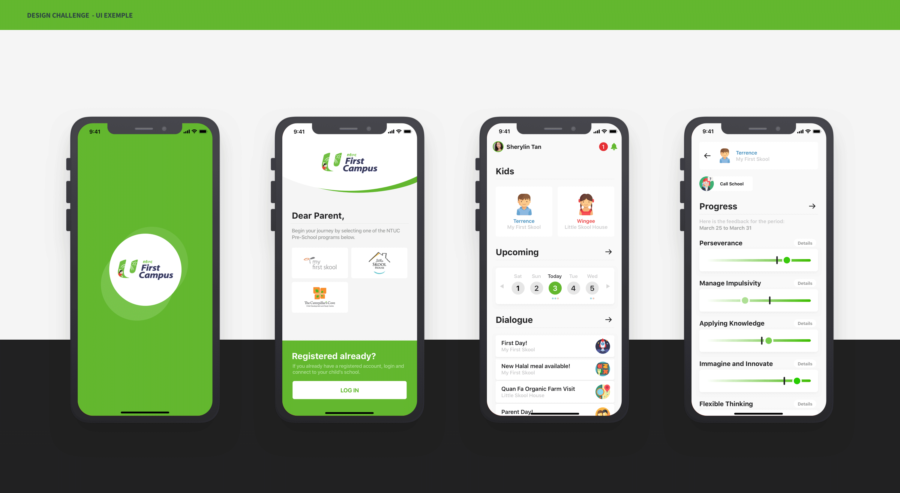
UI
PROTOTYPING
They are a great way to communicate with developers. Prototypes also help to emphasize features and other critical elements of the UI. One shouldn't underestimate the power of nice transitions. It helps to smooth the experience and give a sense of quality to a product.
BRANDING AND SIMPLICITY
I've decided to keep the NTUC branding color for the introduction part of the App. It is essential as it confirms the parent he is on the right App, and it is necessary for NTUC as it brands out the user experience. Sadly I noticed all the App from NTUC lack some consistency in the way it communicates visually.
I've also gathered the schools' different logos to make it easy for the parent to pick the right program.
Finally, I've made sure to keep the App super simple as per our goal and avoided building a childish-looking App. It may be kids-related, but this App is a functional product for parents. Blue and pink everywhere wouldn't make sense.
Let's Get in Touch


