Raiju Controllers Companion App
A personalized PS4 experience

CONTEXT
After Sony allowed us to build the first licensed wireless PS4 controller, we had to deliver the user with the premium experience expected from a Razer product. Here is a look at how we handled the challenge and built up the experience.
WHO ARE THE USERS?
- Competitive gamers
- Multiplatform Gamers
- 16-26 y/o
A large population of the first Raiju iteration owners was anxious to see the evolution of the device. We also had to convince a more skeptic population, not yet ready to invest in a gaming premium device.
WHAT DO THEY WANT?
- Customizations options
- Competitive advantage
- Premium feeling
Surveys and feedback showed that the quality of material used to build the device was extremely important for both a premium feeling and to reduce the sweaty palms effect. Keys mapping was also in high demand.
PROCESS
DEFINING PRODUCT
First, we had to understand in detail how the firmware and the devices were going to communicate. Especially when it comes to Bluetooth and BLE connection, restrictions are many. We have to assess how much Lag we might be dealing with—identifying pinpoints where the user might face trouble and get stuck in the pairing process.
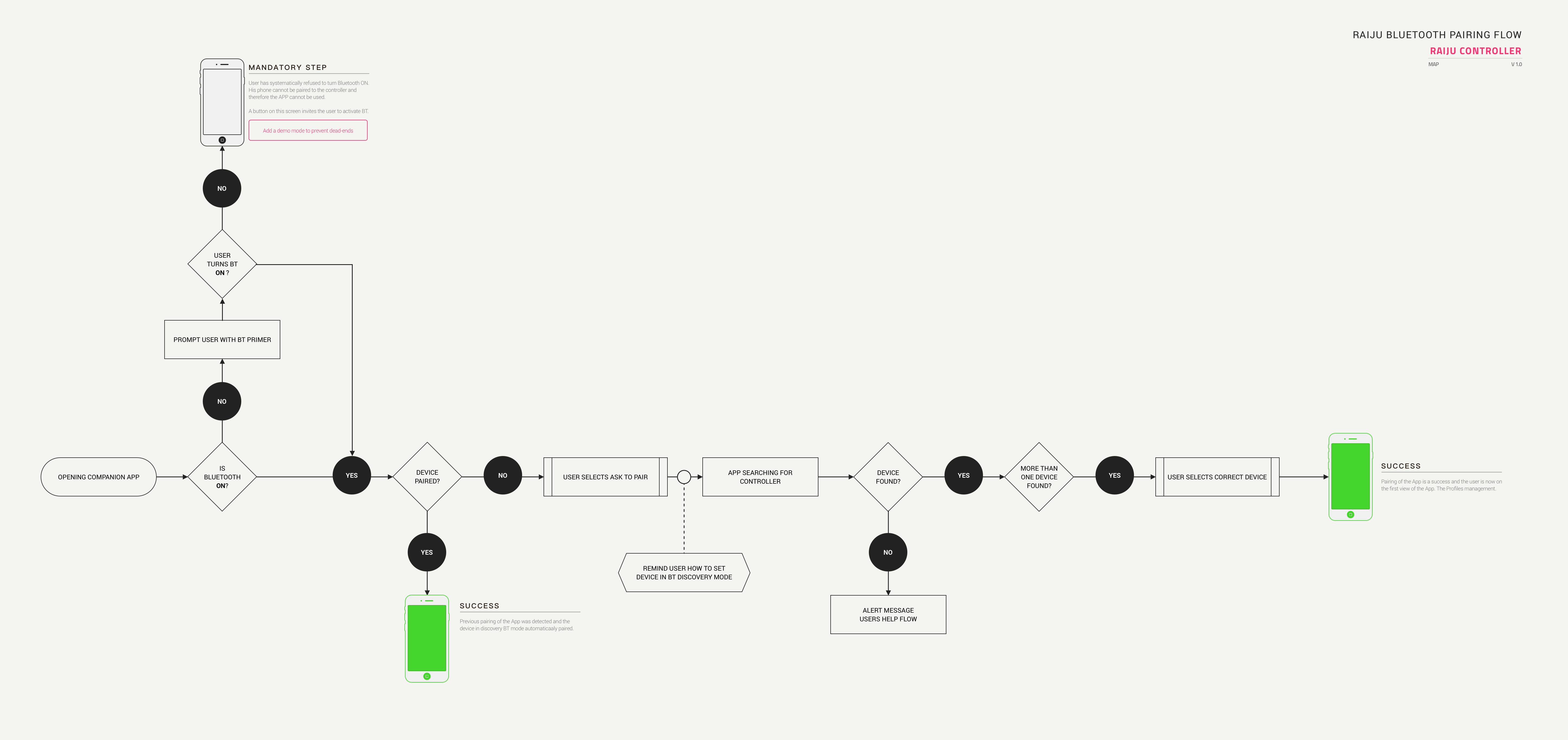
IDEATION AND MAPPING
Once we reviewed the flowcharts with developers, we want to map the user journey. First, with low definition wireframes, going more and more in detail as we validate each step. This map is excellent support for discussions, allowing to point at a specific moment in the user journey.
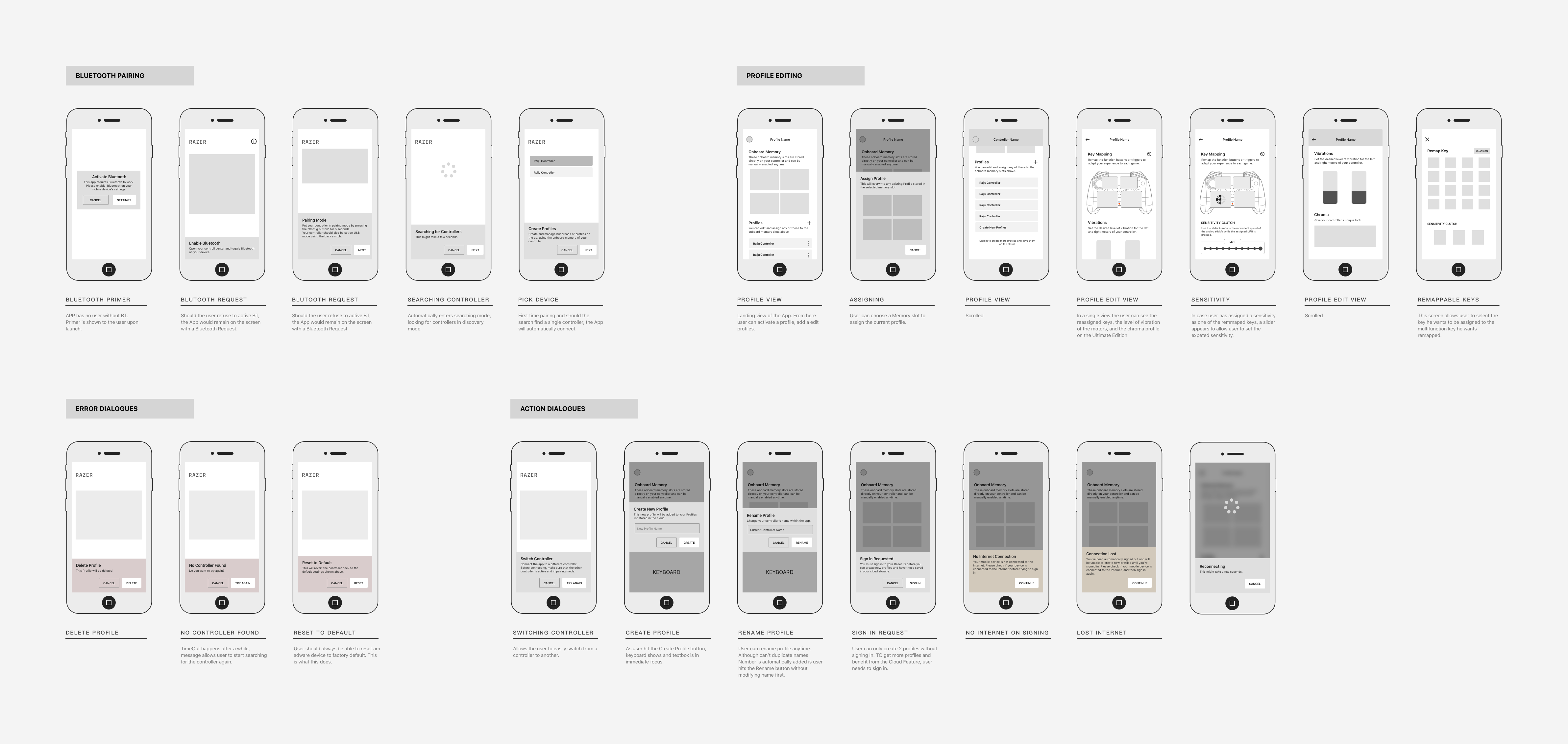
PROTOTYPING AND TESTING
Testing is a vital part of the process, after empathizing with the user and defining the best product. After ideating and determining what should be the best MVP, we must now validate all the decisions we've made. For that, we must reach to the user again and try out the prototyped solution for every significant aspect of the user journey.
PROTOTYPE
We focused our testing on the only aspect of the App that was not purely visual.
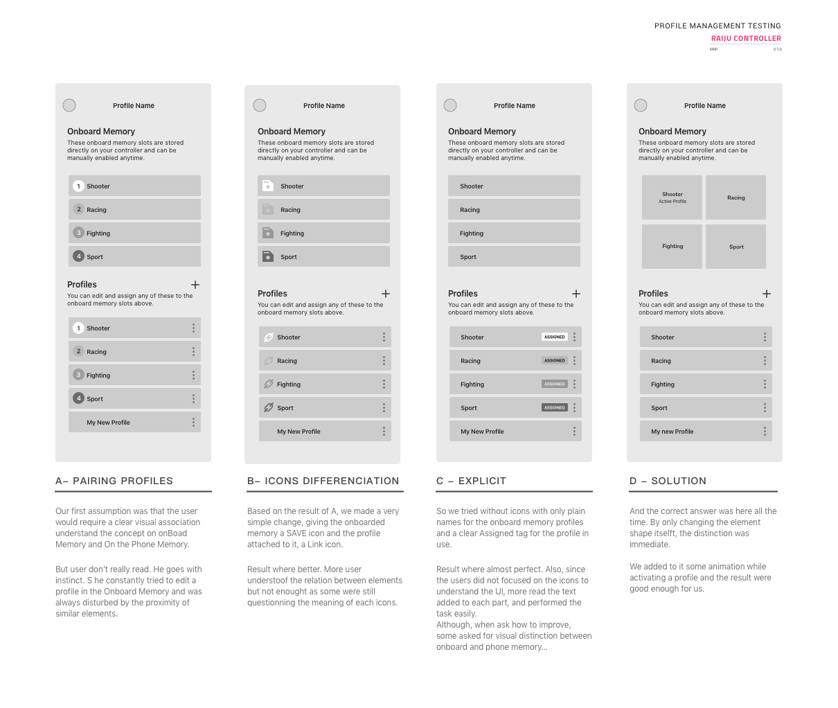
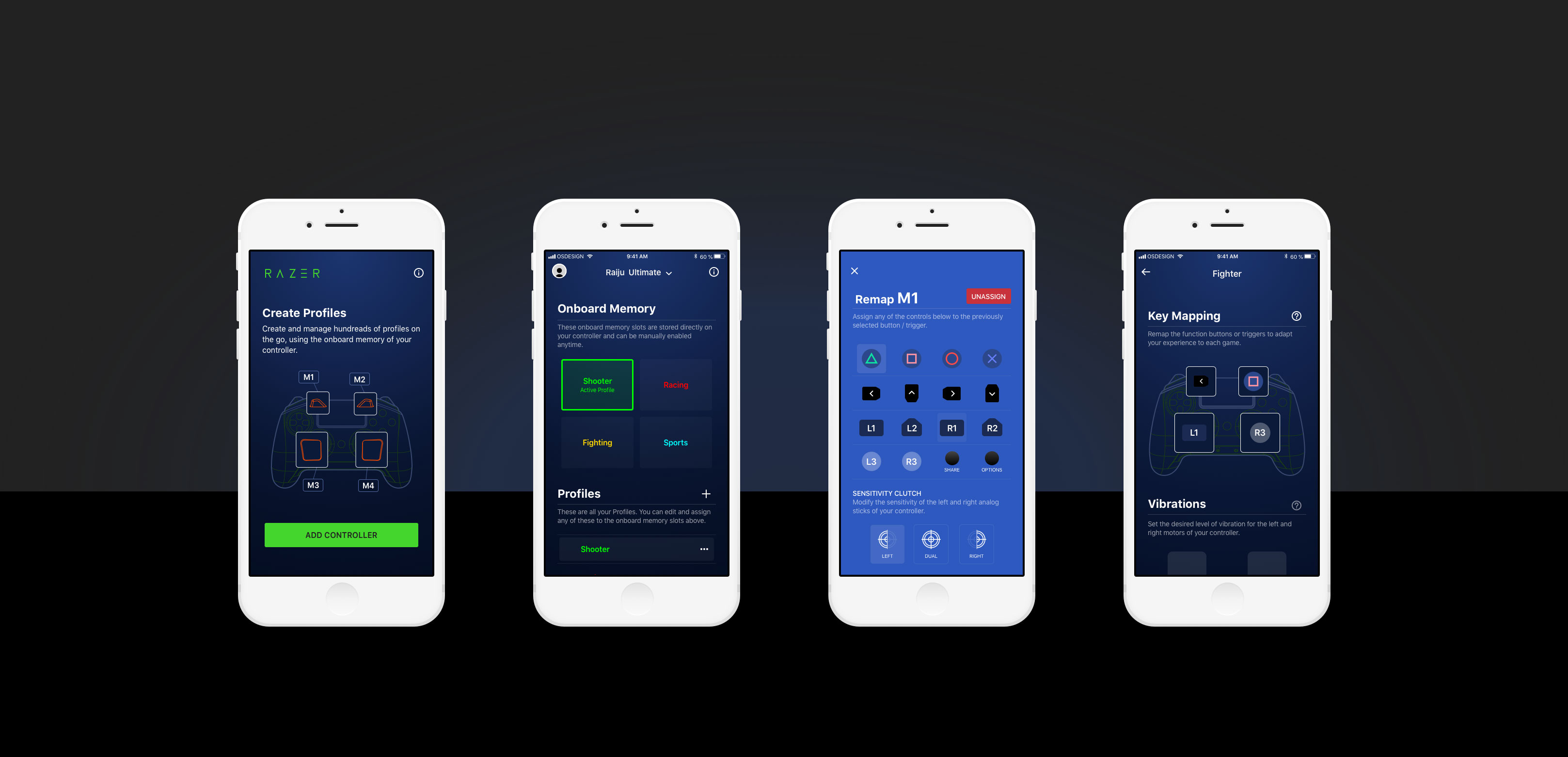
Since the number of memory slots in the controller was limited, but the number of profiles in the Cloud wasn't, we spent most of our testing effort ensuring users understood when a profile was either Assigned, Saved Locally, or Saved in the Cloud.
TEST
Less is more, again, gives the best results: matching colors and names. Constant feedback was also to add an icon to confirm the cloud upload status. Once added, the test result was finally positives.
ITERATE
We always allow ourselves to go back a few steps. When test results give unexpected feedback, we sometimes have to empathize again with the user to make sure we haven't misinterpreted some input. Once done, we edit prototypes once again and test them.
DOCUMENT AND IMPLEMENT
To consolidate the process, we document every decision made along the way. The prototype will help provide information on the UX/UI and the expected transitions effects; it will serve as a Gold Master for the developer. In a fast-paced environment like Razer, it is essential to take responsibility for the work done. Once delivered to the development team, this document isn't expected to change.
DESIGN
Once the product has been documented, and the user journey is defined, building an App within the Razer ecosystem is straightforward. Established guidelines help the designer save time on buttons and default navigation and focus his attention on specific areas of the flow that are key for the user. In this particular example, we decided to allow ourselves to divert from the original set of colors to highlight our partnership with Sony better, setting the primary color a deep blue instead of our classic dark-grey.
ANDROID CENTRAL
The app's interface is sleek and easy to use as it's not cluttered with extra garbage to needlessly confuse you.
TECHRADAR
The app is solid, super simple to use and makes for fast and convenient tweaking.
GAMESRADAR
The companion app syncs to your controller via Bluetooth and provides a simple, user-friendly interface to swap things around.
Let's Get in Touch


